Yourcopay
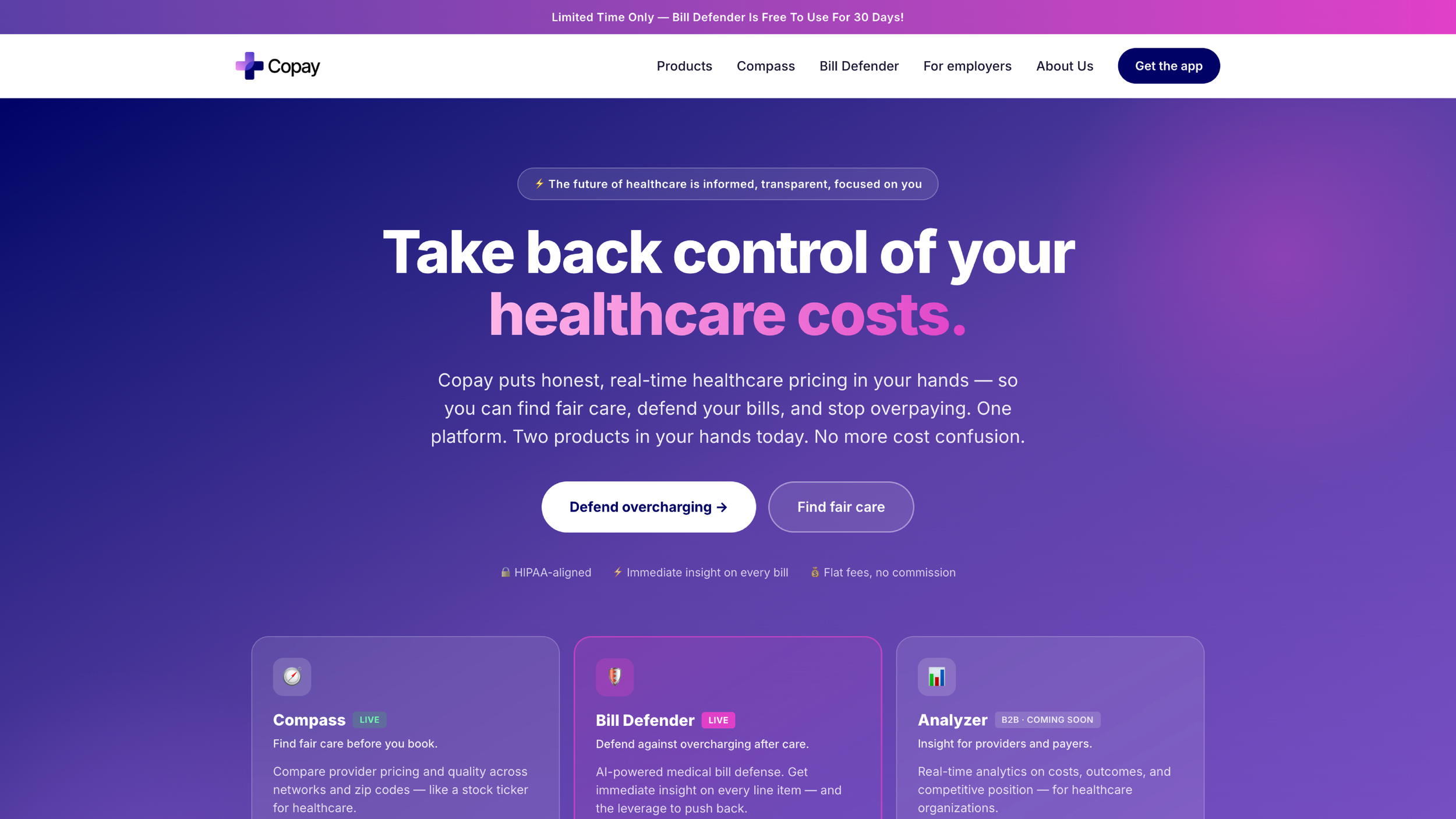
Copay puts honest, real-time healthcare pricing in your hands — so you can find fair care, defend your bills, and stop overpaying. One platform. Two products in your hands today. No more cost confusion. View at: www.yourcopay.com
The price was always there. I made it visible.
Copay promises upfront healthcare pricing — but the promise was buried below the fold. This is a redesign that puts the number a worried patient is looking for within five seconds of landing.
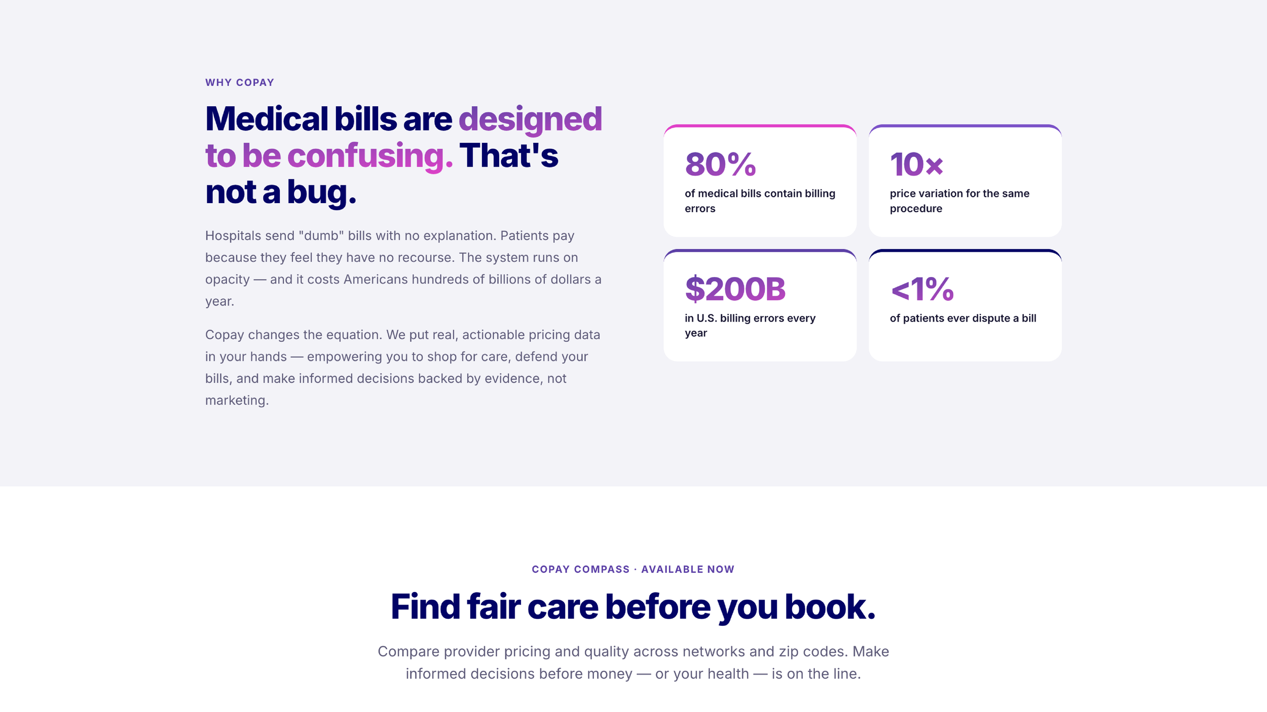
Healthcare pricing is opaque on purpose. That makes people anxious before they ever book.
People don't shop for an MRI the way they shop for shoes. They arrive scared — facing a bill they can't predict, on a site that asks them to sign up, choose a plan, or read a mission statement before showing a single number.
Copay's entire value is transparency. So the core design failure is simple to name: the homepage talks about transparency instead of demonstrating it. The fix is to lead with the thing everyone came for — a price.
The anxious price-checker
Dana M. · 34 · high-deductible plan
Got a referral for an MRI. Her deductible isn't met, so the cost is hers. She wants one thing: a believable number, fast, before she commits.
"I just want to know what this is going to cost me before I walk in. Why is that so hard to find out?"
Persona synthesized for this exercise from common high-deductible-plan pain points; not from formal user interviews.
Where the current journey breaks down
A mapped journey of Dana's first visit — and the moment her trust slips.
Lands hopeful — "finally, transparent pricing."
Sees a value statement, not a price. Starts scrolling to find the tool.
Asked to pick a plan / sign up before any number appears. Friction.
Either commits effort or bounces to call the provider directly.
Competitive teardown
Compared against other price-transparency tools. The strongest ones surface a sample price instantly; weaker ones gate it behind sign-up.
Key insight
Trust in a pricing tool is established the moment it shows you a real number with no strings. Delay that, and the promise feels hollow.
Design principle
"Show, then ask." Demonstrate value with a live price before requesting anything from the user.
Before → after, by decision
What's not working
What I changed
Low-fidelity wireframe
Structure first, in grayscale, so the layout decision stands on its own before any styling.
The single structural move
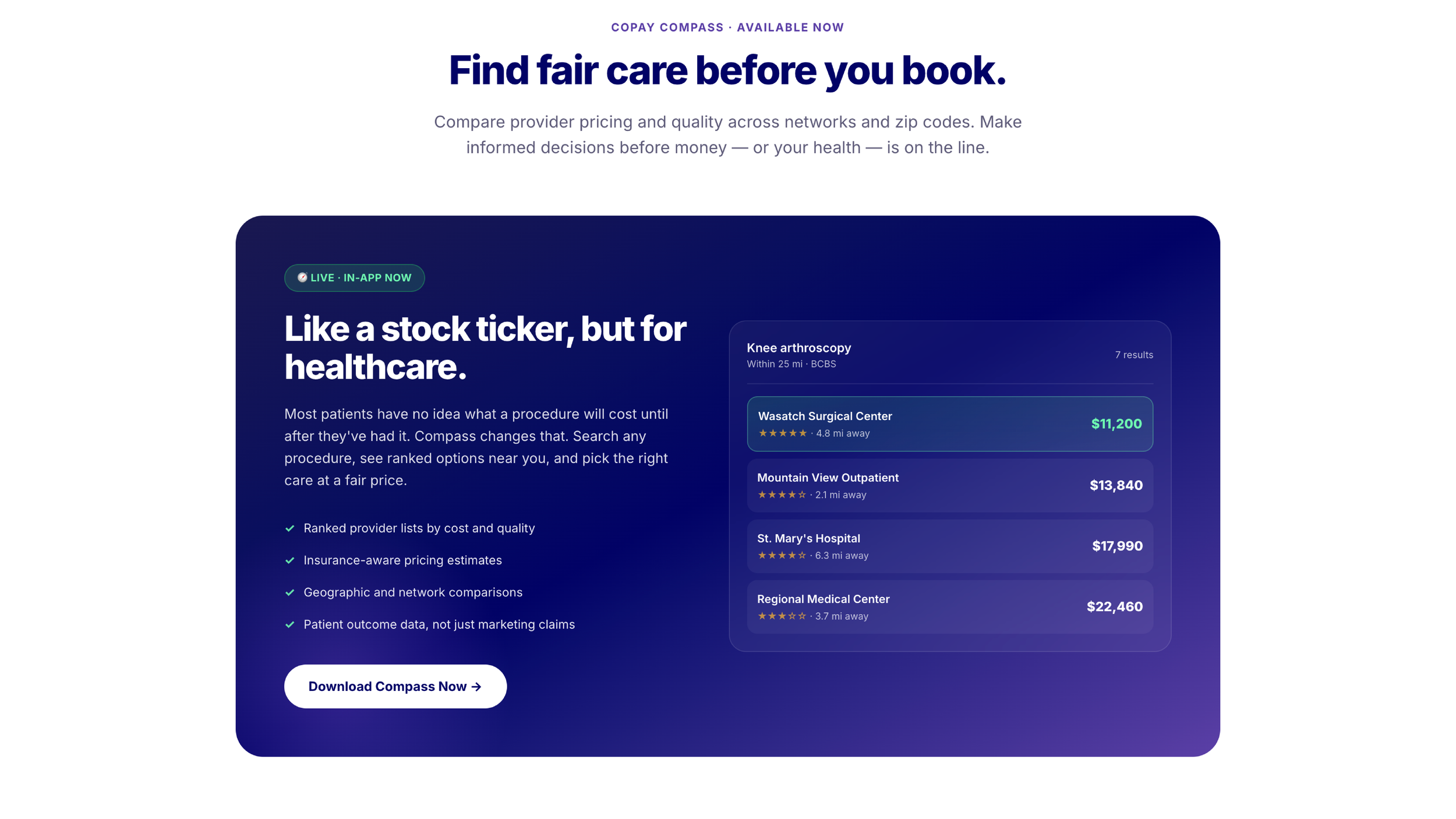
Everything reorders around one rule: the search field and a sample result appear above the fold. Education, plans, and sign-up all move below — reachable, but never in the way of the first answer.
This is the whole thesis of the redesign, expressed as layout.
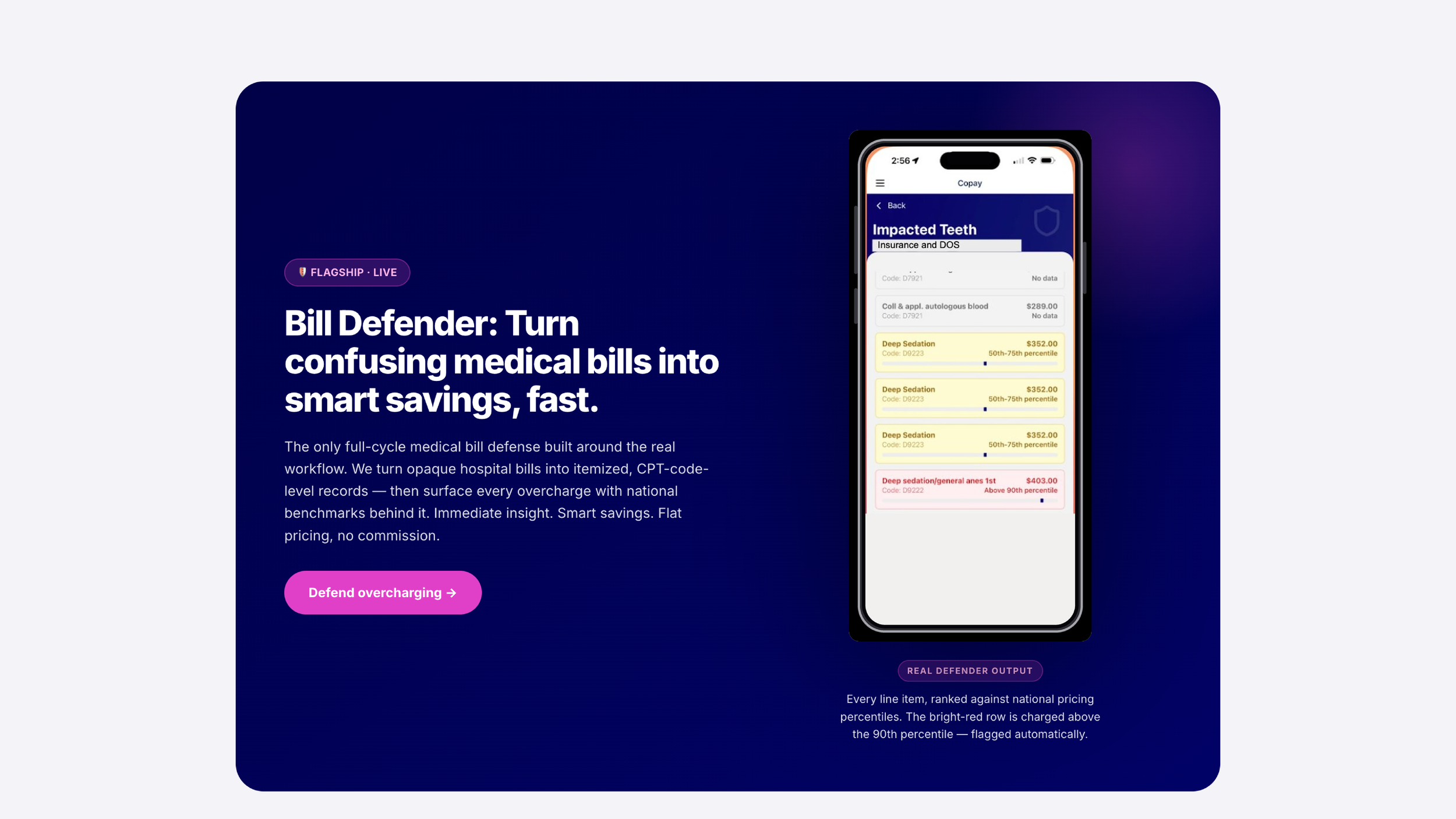
The tokens behind the reveal
Green is the "reveal" color — it only appears on real, visible prices, so the eye learns to associate it with clarity. Purple flags friction. Ink anchors the opaque "before."
Prices are set in mono so digits align and feel precise — like a receipt you can trust.
The redesigned homepage
See what care
really costs — before you book.
Search any procedure. Real prices near you, no account needed.
High-fidelity concept mock. Prices and providers are illustrative.
What I'd measure
A redesign is a hypothesis. Here's how I'd know it worked.